Building a digital learning and research hub for the history and culture of Norman Sicily (1061-1194)
Team
Designer, Project Director, and Engineering Lead
Timeline
January – May 2025
Contributions
Information Architecture
Style & Brand Guide
Interactive Prototyping
Weekly Stakeholder Engagement
Web Design
User Testing and Research


Solving major discoverability and usability issues in a content rich site for multiple audiences
As one of two UX designers for the Norman Sicily Project, I worked closely with stakeholders to define and design a new visual and user experience for a digital scholarship hub. I worked independently and collaboratively – navigating constraints to define solutions driven by our understanding of our users, driving the future of digital humanities scholarship.


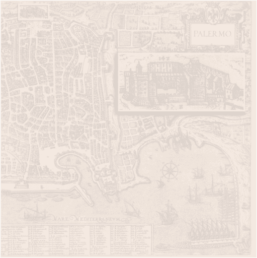
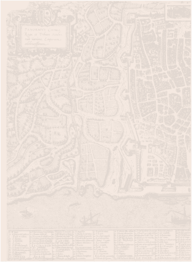
BEFORE


Reimagining how research results are stored and shared – for students, educators, and researchers
Through carefully thought-out changes to the information architecture combined with a new navigation experience, we transformed a content-heavy and scattered database of cultural and scholarly material into an easily searchable collection of knowledge.


A unified visual language to optimize accessibility and create a memorable brand
The style and visual foundation of the Norman Sicily Project website was inspired by the vibrant and rich colors of Sicily’s art and architecture. We balanced the accessibility and legibility of the site with a unique visual language and created a pattern library that improves scalability.

How might we gather and collect various kinds of learning materials to optimize discoverability?
Collect and understand
We started out by understanding existing materials through stakeholder interviews; considering what a material is, how it’s used and produced
Define and sort
We then sorted the materials into text-based and multimedia materials because of the distinction between their storage and presentation


A simple and scalable database structure to house text-based materials
We then delineated a database structure to house text-based materials in a blog post format. This keeps everything consistent and allows PIs to add additional resources while keeping everything searchable and discoverable.

Tabs vs. Filters?
One design decision that emerged in designing the database was whether to use tabs or filters; we chose to use tabs because it kept the database simple and straightforward for first time users and the backend more manageable.
Making database resources easily findable in the nav bar and with entry points throughout the site
We then began to delineate the rest of the website – populating each page and the navigation bar with entry points to various resources


Using an audience-first approach to define user journey and navigation
One critical ask from stakeholders in the beginning of the process was making the website tailored to their core user groups: students, teachers, and researchers. We mapped out the following persona based on existing user research to determine our next course of action.
“We want to make it clear that the Norman Sicily Project is open to everyone to learn and find what they want!” –– Project Directors
Student

Students are looking for easy and digestible materials to jump start their learning/research, often for school. Students want to find resources quickly.
Researcher

High school and undergraduate educators want resources that could make their teaching easier and engaging. This includes lesson plans, images, videos, and interactive activities.
Teacher

Researchers need access to the wealth of data bibliography collected by the NSP to explore topics in-depth. Researchers are multifaceted, working in topics such as history, art, religion.
How might we integrate entry points and journeys for different users in the website’s information architecture?
The needs of our users can best be met by directing them to the different resources that they want. Therefore, I iterated on different ways of placing entry points for different audiences in the information architecture:

Information architecture for the NSP website showing links between different pages and materials
Solution: Incorporating introductory pages for students, researchers, and educators
An opportunity emerged for us to create introductory pages for each audience and display them in the navigation to maximize discoverability.
For example, the introductory page for students might include Essays, Case Studies, Images, and Data Viz.
Designing the navigation: Iterate, prototype and repeat!
I iterated on how to incorporate introductory pages for students, researchers, and educators into the website’s navigation. Through prototyping, I quickly brought the information architecture to life and allowed collaborative adjustments with non-technical stakeholders.

Iteration #1
A bit clunky and the “for” is unconventional
Iteration #2
Audience pages don’t fee distinguished
Iteration #3
Unconventional and takes too much real estate
Iteration #4
Clear distinction between website architecture & entry point for key user segments
Combination of tree testing & generative scenario-based interview
Because we did not have enough resources to talk to users at the beginning and during the design process, we decided to combine generative and task-based testing to understand user goals and validate design decisions. Here is an overview of the script I devised and used for user testing:
PART I
Generative interview using the Homepage and Resource pages
*Understand initial reactions and goals
*“Where would you go next as a [researcher/student/educator]”
*“What do you expect to see?”
PART II
Tree testing the information architecture and navigation using scenarios
*“You are looking for an article on religion in the Norman Sicily period, where would you go?”
6 USERS

2 Students

2 Educators
2 Researchers
Adhering to our audience-first principal, we spoke with each user segment

Moderating remote user testing with a production-grade prototype (blurred to protect user’s privacy)
Help users quickly identify and understand a potential resource
In user testing, several users reported needing a bit more information when browsing the learning material database – users wanted our help understanding the “so what” of each piece of material. I devised the following changes to provide more context for users in the database:


Final prototype and handoff
At the end of this project, we documented design decisions and created an annotated hand-off file alongside an interactive prototype. Stakeholders were extremely satisfied with our work and hired a developer to turn our design into a reality.
Designing for specific user segments rather than a general idea of the user
A unique takeaway from this project is learning how to design for specific user segments and their journeys rather than a general idea of the user. This approach informed our process from ideation to testing and allowed us to make nuanced, evidence-backed decisions.
The aesthetic usability effect?
This is my first project heavily involving both visual and web/ux design, I had to independently make a lot of decisions without a plethora of data. One of the biggest takeaways in this process is 1) aesthetics and usability sometimes go hand-in-hand, but 2) aesthetics doesn’t always achieve the goal or metrics we had. When in doubt, I tried to get direct user input whenever possible to help make design decisions.


